MKC Architecture Office
MKC ARCHITECTURE OFFICE
Location: Columbus, Ohio
Completion Date: 2021
Project Size: 7,500 sf
Project Description
Originally built in 1922, this 100-year-old building is a live-work office building. This unique building has had three lives before transforming into an architectural studio. In 1919, the building was completed as a candy factory for the Purity Candy Company. It was later turned into a tire warehouse. Then again, it was later renovated and turned into a loft apartment. The building is 4 stories and 26,000 Square Feet, with MKC Architects occupying the newly renovated first and second floor.
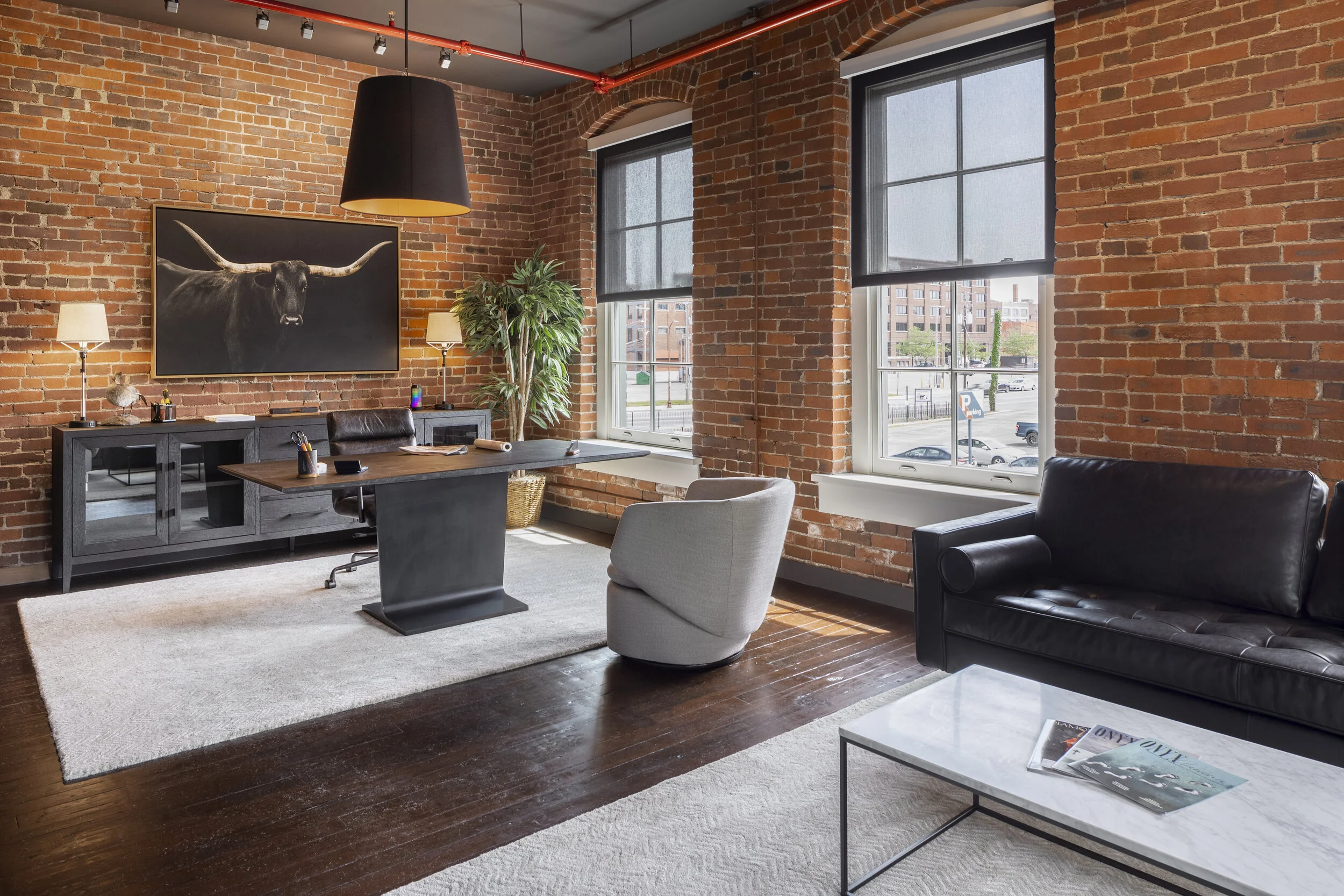
The original brick on the exterior creates a timeless look which is also carried out In the interior. The building still maintains its character, including the original coal chute and furnace/boiler are still in place. MKC takes great value in the adaptation of older buildings, and we are very proud to call 161 N 4th Street our new home. The 4th Street Corridor is one of the main arteries of the city. Starting at the tip of German Village, it runs north through Downtown, Italian Village, Weinland Park, the University Area, and finally ending at the south end of Clintonville. 4th Street is quickly becoming a second High Street through Italian Village and the “South Fourth” area of Downtown is adding bars, restaurants, and housing at a dizzying pace. Nestled between new neighbors Pins Mechanical Company and Jackie O’s Brewery, we hope to add to both the vibrancy [and the patronage], of these establishments.
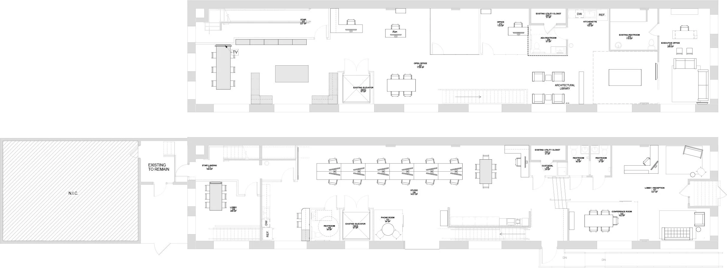
Using contemporary and unique elements in tasteful ways, we renovated the building to feature open spaces while still maintaining its original characteristics. The design of the interior space reinforces the narrow linearity of the building itself. Workspaces are organized around a newly created axis in a 50’ high-top work areas - 12 in total. Each workstation features a super-ultra wide 43” monitor, which allows each employee to plug and play with their laptop. This arrangement allows for flexibility of staffing, where designers can relocate to new seats easily depending on project teams, etc. Resulting from the open & collaborative nature of the primary work space, smaller break-out spaces are provided throughout each floor. Of particular importance is the studio work table featuring an 8’ white board and a 75” television monitor for projections. Other spaces include the ‘phone room,’ which we have endearing named ‘Tommy’s room’ after old markings on the original brick. This diversity of spaces allow for a user-defined work experience, where staff can move as desired to create their own workday.
SPATIAL Organization
The studio space is organized as a 5-bay linear grid, with a continuous 4” pendant linear light fixture delineating the zones - which extends throughout the remainder of the office space connecting different zones. Each bay is further defined by two squared-grid acoustic panels - which help with spatial scale and sound transfer. Replacing an old fire stair, a new copy and print center frames a new architectural stair while allowing new access to views and light. The space is delineated using common materials in new ways. 3/4” electrical conduit was placed 4” on center from floor to ceiling. This element not only creates new space and screens the stair, but also serves as the stair guardrail, allowing the building to feature a streamlined and minimal hand rail only. Throughout the building 13-ply Baltic Birch plywood was used in a variety of ways. Tying the building together, the material is used as a feature wall, open shelving, and built-in custom casework [in both kitchen and copy areas]. The plywood received a clear protective finish and features exposed edges, showing off its natural characteristics.
• Linear // Flexible Working Spaces
• Informal Break-out Spaces
• Unique Material and Spatial Definition


